In graphic design, there are principles of design that should be considered. These principles are what typically separate good design from bad design. All these principles have a relationship between each other and appear in every well designed piece of work you see.
A good grasp of design theory will mean there is always substance behind your work.
The key principles of design are: contrast, hierarchy, alignment, balance, proximity, repetition, simplicity and function.
Whatever work you produce be it for a magazine, poster, website or advertisement, the principles of design should be considered.
A good designer will keep these principles and guidelines in their toolkit and will consciously use them to develop their ideas.
Lets have a closer look at the contrast design principle:
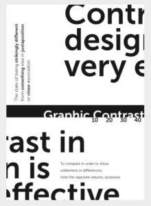
Contrast
Contrast occurs when two or more visual elements in a composition are different.
In design we use contrast to generate impact, highlight importance, create exciting graphics and create visual interest and dynamics.
Context is integral to contrast. We may think that the chosen visual object in a composition says something about itself but it is more often the visual elements around it that give it it's meaning.
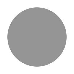
For example: Here is a simple circle. What is it saying about itself? Well, all it says here is that it's a circle but does it say how big or small it is? or how far away from us it is?

To suggest that, we need another visual element. So here is a smaller circle and by placing this new visual object next to the original circle we now create contrast by context. By contrast, the above image is now saying that the original circle is bigger.
But what if we bring in another circle the same size as the original but this time it's darker. Well this may suggest that this circle is perhaps closer to us or more important and it certainly grabs our attention more.
Contrast creates interesting relationships between the visual elements. It can push elements away, connect them or complement them. Without contrast, visual elements can be meaningless.
Contrast provokes our visual senses. Our eyes like contrast because it grabs our attention and makes it easier to digest and make sense of what we are seeing which is why it can be a strong method to communicate visually without the presence of type.
Below are a few examples of how contrast can be used in design:
Contrast in Shape
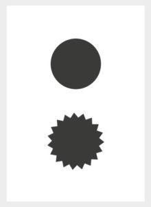
Here we have two shapes almost identical in scale but they both vary in characteristic. One has a smooth surface and the other has a pointed surface. Now, what shape is your eye drawn to? In this case it may be the shape with the smooth surface is so simple it makes us want to look at the other shape more because it's more complex.
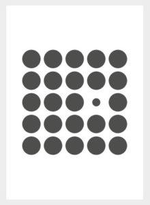
Contrast in Colour

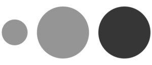
The next example demonstrates contrast in colour and as well as shape. Even though we have a mixture of shapes, they appear in various degrees of colour. Regardless of contrast between shapes here, there is a clear contrast of colour or tone. The darker the shape, the more attention it commands.
Contrast in Scale
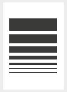
Here we have eight strokes but in different stroke sizes and a grid of circles. Again, we can see how context is integral to contrast here. It's the visual elements around each other that give meaning to one another.
Contrast in Layout
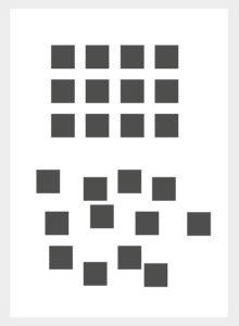
Next we have contrast in layout. The top composition appears regimented and structured. The lower layout seems more free and random.
Contrast in Type
In type, contrast is commonly used to create hierarchy and structure. There are many methods for creating contrast in typography: alignment, typeface, type size, colour and weight can be all considered.
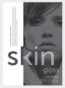
Contrast in Type and Colour
In this next example we can see a word pop out from a block of type by simply being of a darker shade.
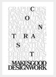
Contrast in Type and Alignment
Here we can see contrast in type in a more dramatic way. We have type in various sizes, weights and alignments. The type is mostly dark but but there is some white cutting through the dark solid bar and we have type cutting off and onto the page from top to bottom.
Contrast in Type and Colour
Next we have some similar type contrast but also contrasting with other visual elements. The main focus is on the title word which creates it's own dynamic as it crosses over from a light space into a dark space which our eye is mostly drawn to.
Contrast in Shapes and Colour
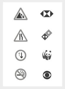
Contrast is such a strong method of communication that it is used on some of the most important visual communication like road signs.
Some of the most iconic logos are some of the most simple and contrasting. Just like how contrast plays it's role in road signs to communicate bold important messages, contrast is used in logos for the same purpose to be remembered.