
Think about how you use your phone. You most likely carry your phone around with you at all times; keep it close by. You’re not alone as, on average, we touch our phone 2,617 times a day.
This equates to using your phone from anywhere between 145 and 225 minutes a day.
Your phone is the thing you pick up to kill time: at the bus stop, in the toilet, when you’re bored, watching tv, waiting for the kettle to boil, to avoid people during your commute. Do you turn to your computer in the same sort of way? Is it a similarly constant companion? I suspect not.
In case you missed it, mobile is the new normal
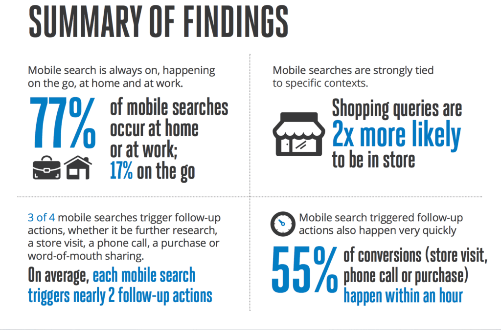
3 out of every 5 searches happen on mobile, and mobile far outpaces desktop as the number one method of searching.
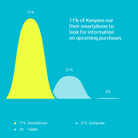
Devices used by Kenyans when looking for information on upcoming purchases. Source - Google Barometer Consumer Survey 2014/15
It used to be that mobile searches happened by people, out and about, on the go, away from home.
Not anymore. According to Google a full 77% of mobile searches now happen at home or work.
Google will penalize your website if it's not mobile friendly
Here’s what the official post from Google Webmasters has to say about the mobile-first index.
"To make our results more useful, we’ve begun experiments to make our index mobile-first. Although our search index will continue to be a single index of websites and apps, our algorithms will eventually primarily use the mobile version of a site’s content to rank pages from that site, to understand structured data, and to show snippets from those pages in our results. Of course, while our index will be built from mobile documents, we’re going to continue to build a great search experience for all users, whether they come from mobile or desktop devices".
From now on, Google will primarily consider the mobile version of your site to rank it in Google (both the mobile and desktop versions). That means if you have a site optimized for mobile, you’ll rank well on both mobile and desktop.
On the other hand, if your site doesn’t perform well on mobile, your rankings will sink on both mobile and desktop.
What Google considers to be mobile-friendly
Google just cares that people will be able to load all pieces of content on your page, read the text without having to zoom or scroll, and interact with any buttons present.
Generally, mobile-friendliness has the following characteristics:
• Avoids software that is not common on mobile devices, like Flash
• Uses text that is readable without zooming
• Sizes content to the screen so users don’t have to scroll horizontally or zoom
• Places links far enough apart so that the correct one can be easily tapped
A great mobile site should look nice, be easy to navigate, and display well on a mobile device.
Evernote is a perfect example:

Pick up your smartphone and go to your website. Ask yourself these questions:
• Does it load in less than three seconds?
• Does it draw your eye to your key selling points or message?
• Is the content easy to read?
• Is it easy to navigate?
• Is it easy to recognize and activate the call to action?
• Does it provide a good user experience?
• Is it a website you would spend time on if it was not your own?
If you mostly answered “no”, then it’s time to optimize your website and capture the traffic and sales you’ve been missing out on.