
What Makes A Good Poster Design?
The poster is one of the most straightforward pieces of visual communication there is and it is also one of the oldest forms of visual communication. Originating back in the late eighteen hundreds with the invention of the printing press, real messages could be easily printed and distributed. And with the invention of the three-stone lithographic process, printing incorporated more colour where posters were used for some of the earliest forms of advertising.
Nowadays, posters come in a wide range of sizes, large to small, but will all seek the same goal.
A poster is typically one piece of paper, either portrait or landscape, with the purpose to:
- Attract attention.
- Arouse curiosity.
- Communicate a specific message.
- Make an impression.
- Invoke a reaction.
The function of a poster is typically to be seen at a distance and is used to either advertise or communicate a specific message. If successful a poster can influence a call to action to find out more, make a transaction, or change perception.
This blog post will take you through a quick presentation of some good examples of what makes for a good poster design.
So, what makes for a good poster design?
The first factor that makes a good poster design is a clear sense of visual hierarchy.
If there are too many elements competing against each other in a composition without a clear order and contrast between the elements, then it will be hard to navigate.
Imagine three people, all talking at you at the same time saying different things. It would be hard to understand and make out who to listen to first, right? Well, the same can be said in design.
A busy poster design can be off putting and fail in its purpose to attract and communicate effectively.
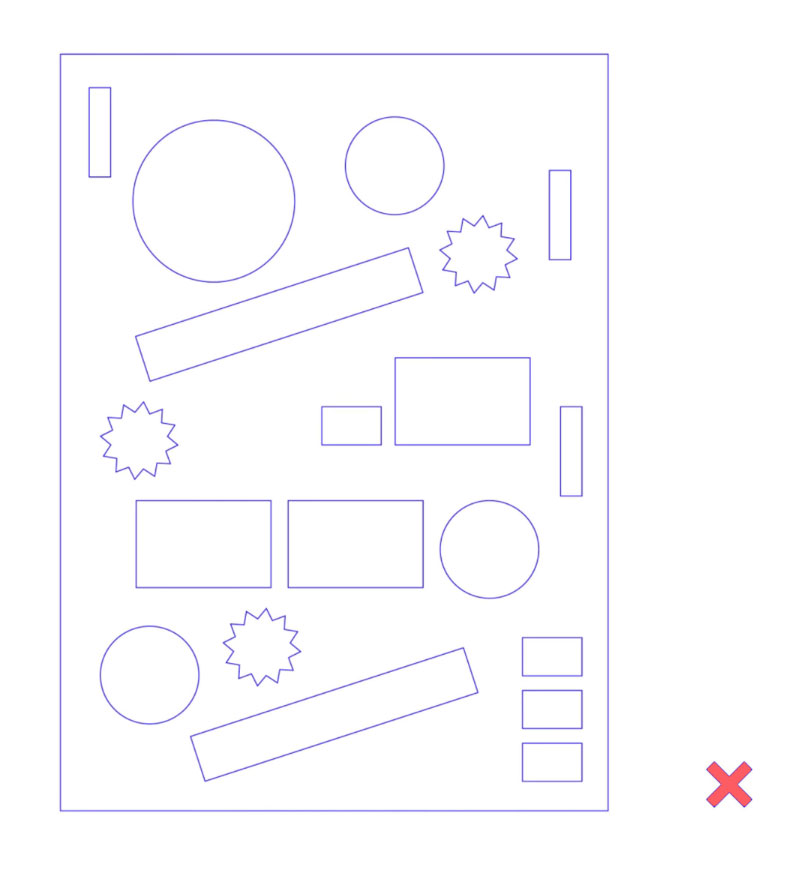
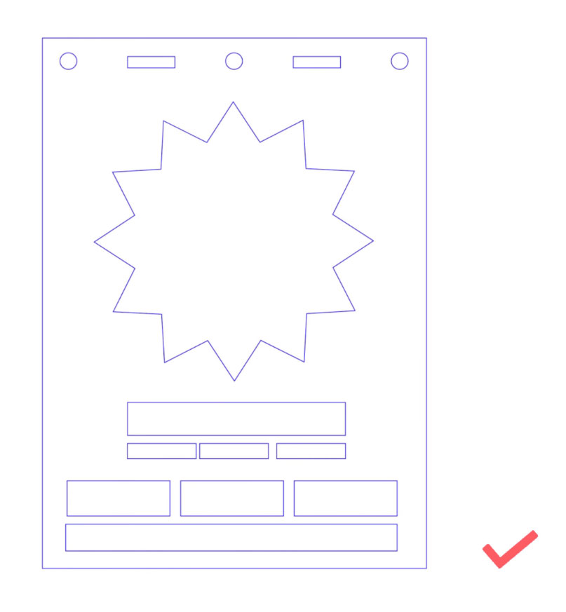
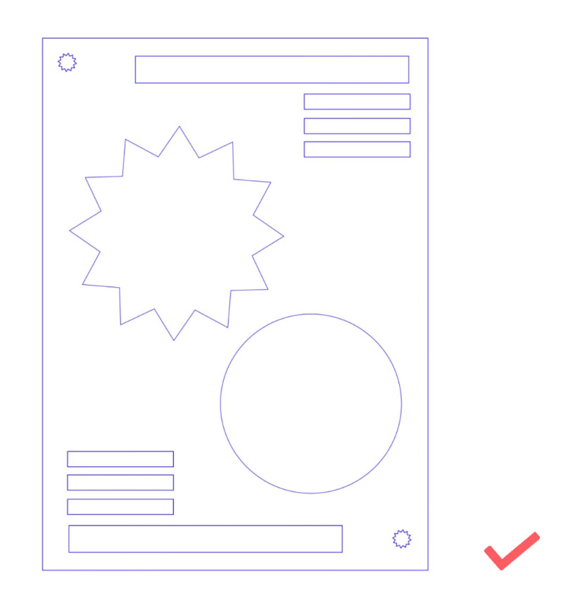
A busy poster design can be off putting and fail in its purpose to attract and communicate effectively.
A good poster design will consist of at least 3 levels of hierarchy:
- The primary hook.
- The secondary hook.
- The supportive elements.
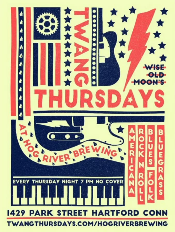
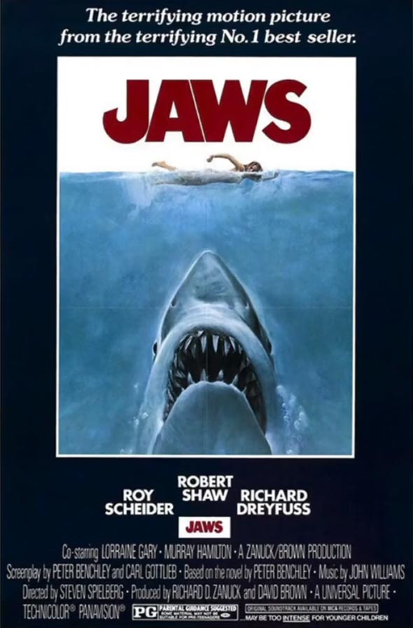
Below are two examples of posters that demonstrate a very clear hierarchy.
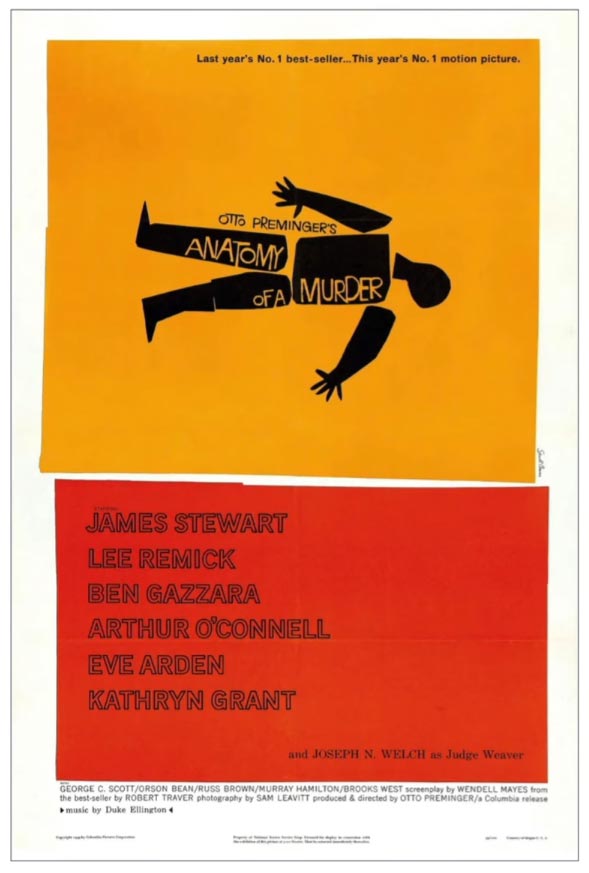
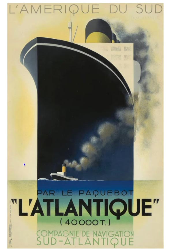
Level 1: The primary hook.
This tends to be whatever element appears to be the clearest, most legible, and has the most contrast in a composition.
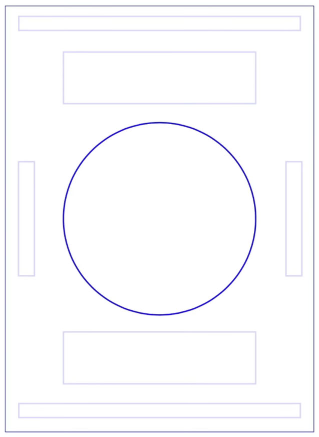
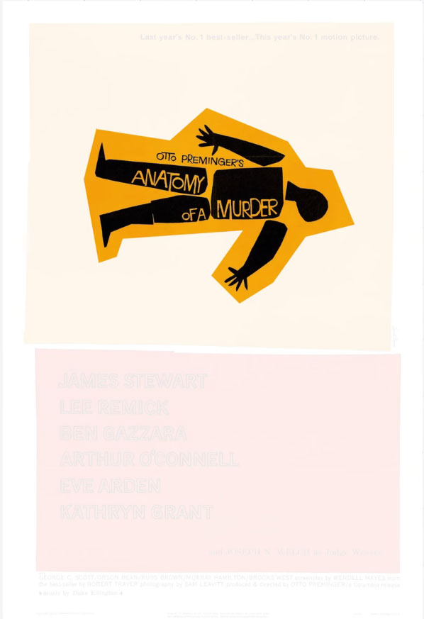
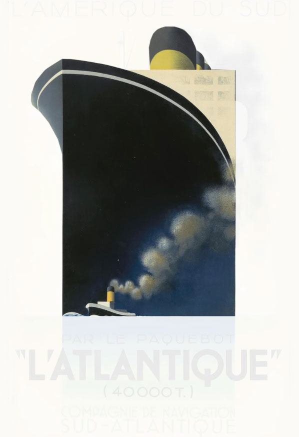
In the above examples, we see that it’s the large visual image in each poster that works as the primary hook here. In the first poster, we are initially drawn to the large illustration at the top. This is because it’s the largest element with the most contrast. And the same applies to the next example where the ship illustration is large in comparison with its surrounding elements.
Level 2: The Secondary Hook.
This will typically be a smaller element that appears close to or near the primary hook to support the message.
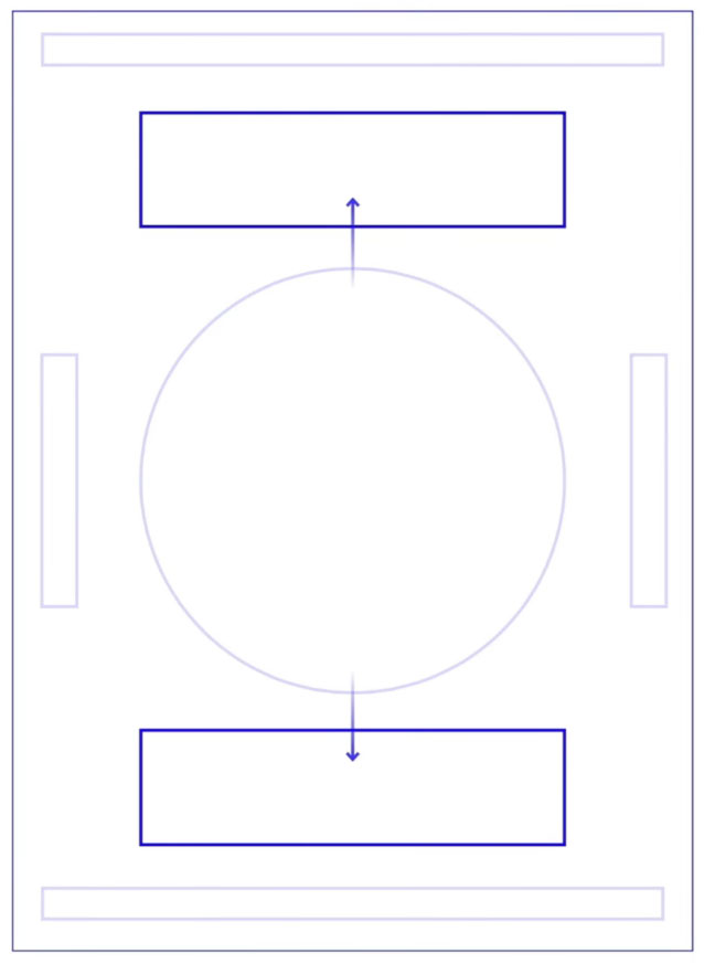
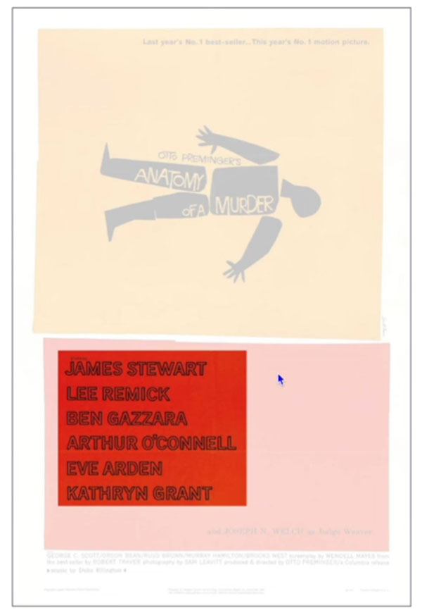
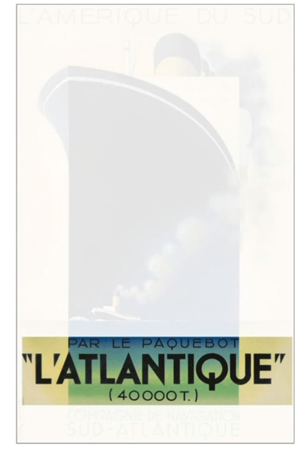
In the first example, it’s the names of the actors starring in the movie that we are drawn to after the primary hook, as these are slightly smaller. In the next example, once we see the huge ship, we’re drawn down to read the header.
Level 3: The Supportive Elements.
In any given design, there may be few or many supportive elements. These will be elements in a composition one will look at once one has noticed and acknowledged the primary and secondary hooks.
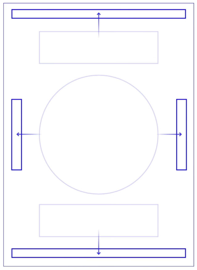
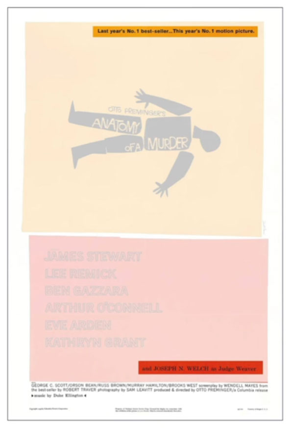
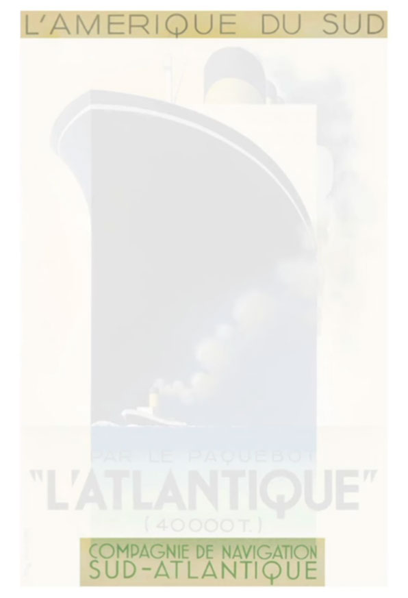
In the first example, the supportive elements are the smaller subtitle at the top and the footer elements at the base. The same is seen in the next example.
It’s practical when digesting information to have a sense of direction. A beginning, middle, and end need to be clear to convey a clear message and lead the viewer.
Used effectively Hierarchy can make a complex message simple, create impact, and a big overall impression. A clear visual Hierarchy and contrast between the elements are important because they can create a clear structure and make a message legible.
The second factor that makes a good poster design is the consideration of placement.
A poster design is not necessarily a one-size-fits-all solution. There are a variety of spaces where a poster design may be placed, and often this can determine the nature of the poster’s design.
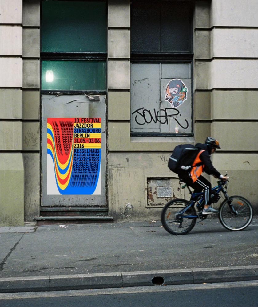

If a poster is placed outdoors, on a wall, on the street or on a billboard then it may be seen fleetingly and thus require a design to be more impactful to work well to attract the eye from a distance.
Simplicity will be a big factor for posters that are seen in an outdoor context. The elements may be larger and have higher contrast with more use of space to draw one in.
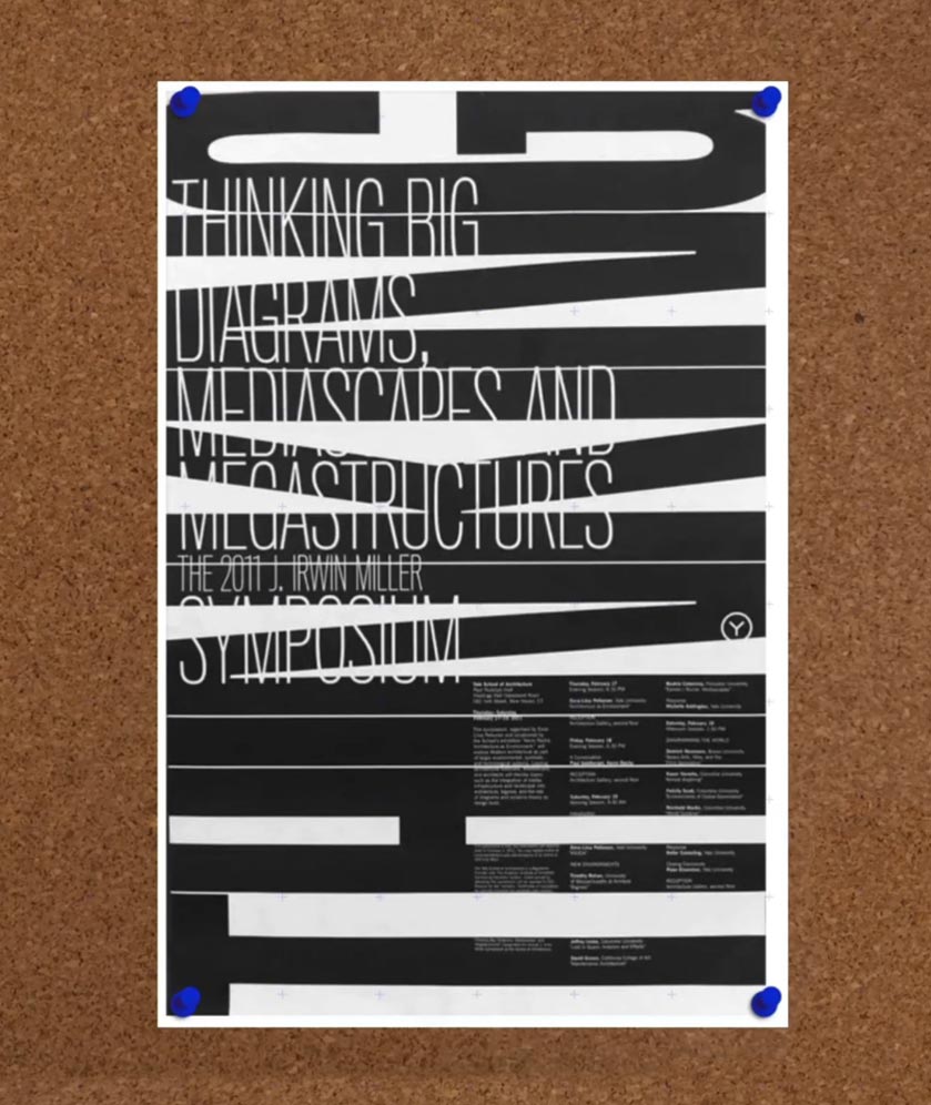
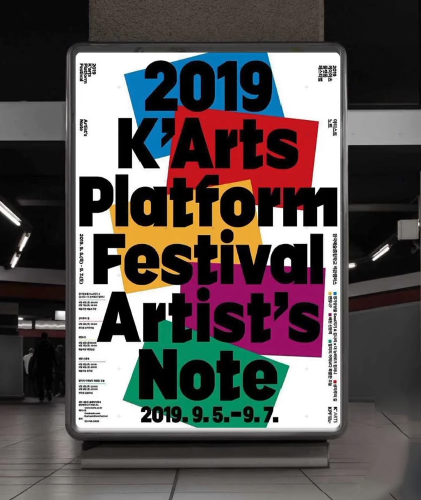
If a poster is to be placed inside a studio, a gallery, an office, or school space, or at a train station then one may be able to spend more time observing.
In this instance a poster can still work to attract attention from a distance and still be simple, however, can be more complex and could include more information.
Like hierarchy, simplicity is one of the most important factors that makes a good poster design. If a poster is simple and is designed with its intended placement in mind then it will work well to communicate clearly.
The third factor that makes a good poster design is the dynamic use of type, image, shape, and form.
A poster can be simple or a poster can be more dynamic.
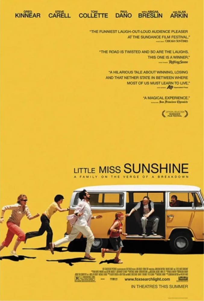

A good poster can be simple and use typography in a clear literal way to communicate a message in the most practical way.
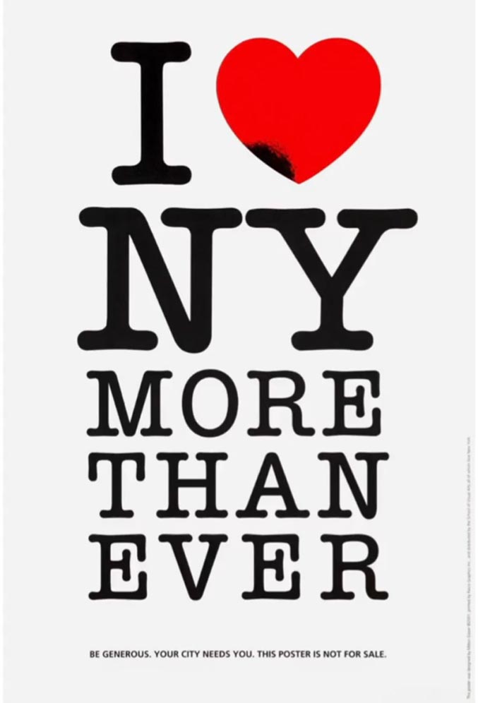
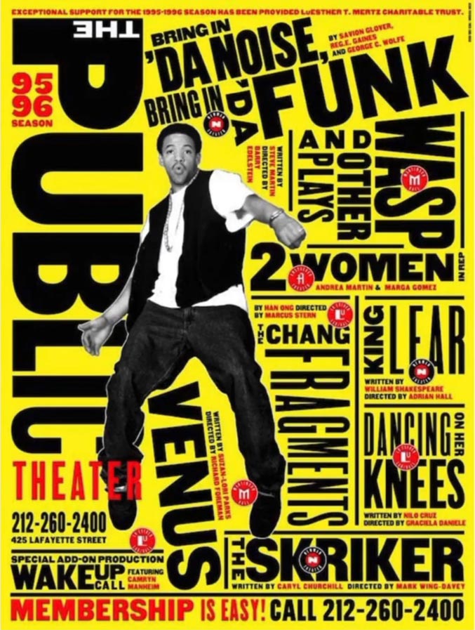
A great poster will attempt to use both images and type together to attract attention and communicate a message in a more visual way. However, the right combination of visual elements can speak a thousand words.
The fourth factor that makes a good poster design is the balance between the elements.
It’s very common for posters to include multiple visual elements in a design, and may choose to either use a large image or large type to attract the eye and deliver a message.
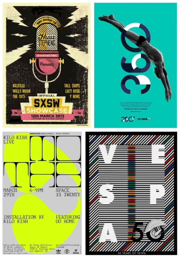


A good poster will have a synergy between all visual elements in a composition including colour, image, shape, texture, and type. A poster may contain all such visual elements but will need to balance them well in order to retain balance and present a clear hierarchy.
The fifth factor that makes a good poster design is to create a specific impression.
A poster is not simply decoration. A poster will typically have a purpose to inspire and influence a call to action to a specific target audience.

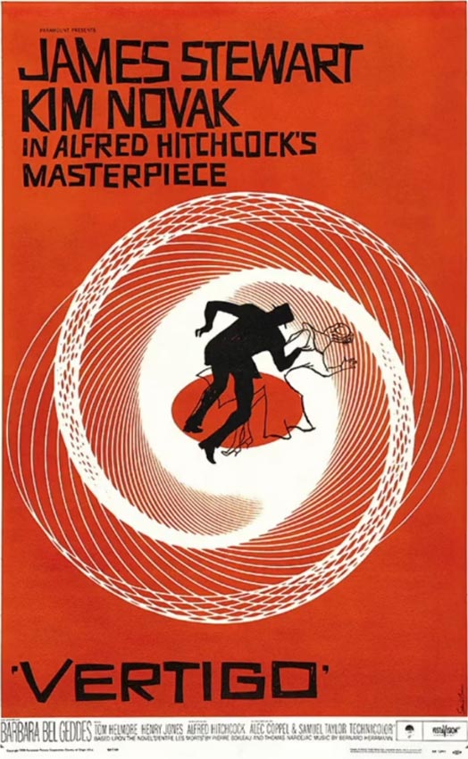
Ultimately a poster will have a goal, be that to educate, change perception, find out more or influence a transaction.
It may sound simple and obvious, but a good poster will incorporate the right combination of image, type, shape, and form to influence a clear call to action and evoke emotions.


Like using the right words to communicate and articulate a message, we want to use the right visual vocabulary with the right tone of voice.
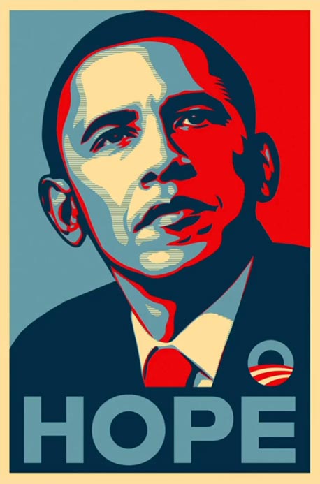

As simple as a poster can be, the right image or combination of images or type can speak a thousand words.
For maximum results, the poster will need maximum impact.
The bigger the impact, the greater the impression which ultimately creates curiosity and a memorable impression.
In conclusion, the key factors that make a good poster design are:
1. Clear sense of hierarchy.
2. Consideration of placement.
3. Dynamic use of type, image, shape, and form.
4. Balance between the elements.
5. Create a specific impression.
Source: Gareth David
