The graphic part of graphic design is made up of visual elements, the building blocks of design. Through the harness of artistic expression, we choose these visual elements and arrange them on a surface in a layout to convey an idea.
The basic visual elements that combine to create graphic design include the following: line, colour, shape, texture, space, form and typography.
Whatever work you produce be it for a magazine, a poster, a website or an advertisement, these visual elements will play a part in your design.
Typography
Typography is one of the most commonly used elements in graphic design and is the most direct way to communicate visually, typically set either as headers or in paragraphs.
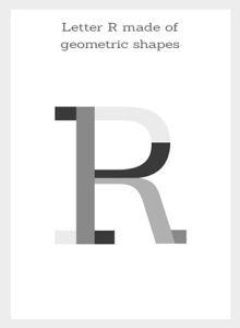
A single letter in a typeface is a combination of geometric and organic shapes which combine together to create a larger shape.
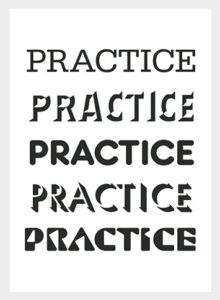
This unique letter shape is an entity and is part of a complete typeface made of other letter shapes. The characteristics of every typeface can be broken down into what is known in design as the anatomy of type.

It's the type of shapes given to the anatomy of type in each letter that gives the typeface its distinct look and feel.
Type is not simply about communicating words. Words are important but what can be equally as important is the style of those words and the way they are arranged on a page. Typefaces can be part of a family of various weights which can be used to express various tones or create a visual hierarchy in the design.
Typefaces are like voices with accents and dialects which have their own distinct pronunciations and characters therefore, typefaces don't just communicate literally but also communicate visually.
The choice of typeface used in the design is crucial to set the intended look and feel, set a tone and add character to a piece of work.
Typefaces have evolved over time, the first typefaces were designed to be practical, cut out of wooden blocks or cast in lead to work in a print press for mass production. Others have originated from various design movements but what they all have in common is that they have all been created to fulfil a particular purpose and express a particular look and feel.
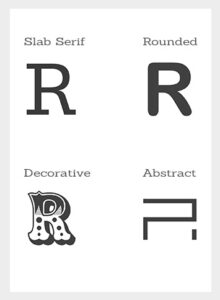
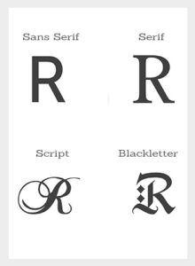
Today, there are many categories of typefaces such as serif, sans serif, slab serif, rounded, script, blackletter, decorative and abstract to name a few with some sharing characteristics of various categories.
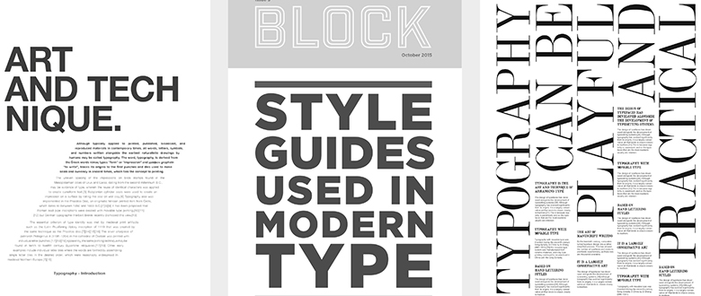
Design throughout history has celebrated the shape and form of type and has shown us that type can be both functional and decorative. The way type has been arranged and the relationship given to it to other elements in compositions has redefined the use of type in design. Below are a few examples of functional and decorative typography.


The first set of examples showcases functional uses of type which are used to inform and deliver a clear message.
Example 1 is a basic use of type justified and placed simply on a page as one block which has a traditional feel with the use of its serif font.
Examples 2 and 3 take the previous technique further add more dynamics with more complex compositions. The examples show type in columns and some type of elements have been increased and used in capitals to add contrast. In example 3 we have a mixture of type weights applied to the header and subheaders to create contrast and hierarchy. Negative space has been considered to create a structure and allow some type elements to stand out. We also see some line elements that have been used to reinforce the visual structure and layout with the headers and subheaders.
Example 4 is simple yet dynamic, where we have a clean bold header with justified type below in a block at a unique angle. Overall this creates a nice contrast with direction and movement on the page.
Example 5 is simple and bold with a decorative font used for what could be a title or header of a magazine or booklet. Under this, we have a bold message capped into a space sealed with two line bars at the top and bottom giving it a bold, rigid, strong and assertive feel.
In example 6 we have a serif font with thick spines and thin crossbars with exaggerated serifs. This font feels quite classy and boutique. Here we have a larger line type to the top which defines the column widths of the type below. The smaller type runs aligned left to each word in the larger type. In this example, the contrast is not only in size but also in alignment which creates an overall dynamic layout.
Even though there are some creative aspects to these compositions, it is not enough to distract from the overall message. They only serve to complement and add sophistication to the message.


The second set of examples showcases more creative uses of type. All of these are used to inform but priority is placed more on the creative aspect of the look and feel.
Example 1 shows how print block letters have been carefully chosen and arranged to look like a face. We're not only looking at the type but also the shape, form, and texture of the print blocks.
In example 2 we have 3D generated type. Unlike the functional 2D examples we have added form, shadow, perspective and depth to add visual factors which add dimension.
In the 3rd example, all emphasis is focused on the craft of the type where we're encouraged to see this as a piece of design art. This is more about the beauty of geometric shapes where the grid and the characteristics of the letter forms themselves. Here the message is not what the type is saying but what the type is saying about itself.
The last 3 examples test the limits of order, alignment, legibility and contrast. In example 4, a lot of words pop out to us in no particular order. Due to the lack of order and focus the types begin to merge together into an overall texture and shape on the page. Examples 5 and 6 take this to the next level where we have almost no legibility of the message to the point we stop looking for legibility but get immersed in the hypnotic shapes. These type compositions have become image textures and now we feel them as opposed to reading them. From practical use to creative use.
In design, type can be used to communicate literally and to tantalise the visual senses to engage emotionally.