Colour As A Visual Element In Graphic Design

The graphic part of graphic design is made up of visual elements, the building blocks of design. Through the harness of artistic expression we choose these visual elements and arrange them on a surface in a layout to convey an idea.
The basic visual elements that combine to create graphic design include the following: line, colour, shape, texture, space, form and typography.
Whatever work you produce be it for a magazine, a poster, a website or advertisement, these visual elements will play a part in your design.
Colour
Colour plays one of the biggest roles in graphic design. It can give emphasis, it can be used as a mechanism of organization, it can create impact and create a specific look and feel in a piece of graphic design work.
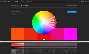
When working with colour, it helps to have a good understanding of colour theory. Colour theory provides us with practical guidance to help us mix colours and create interesting colour combinations and it all starts with the colour wheel. The colour wheel is a really useful tool designed to help us choose colours that work well together.
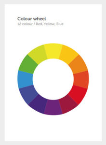
The above is the red, yellow, blue colour wheel model which consists of 12 colours. If we jump onto the Adobe colour website we can see this colour wheel as more of a spectrum. This is a very useful resource to explore and create colour schemes.
The colour wheel consists of primary colours, secondary colours and tertiary colours and these can be split into warm and cool colours. Lets take a look at each of these:
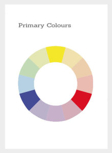
Primary Colours
Primary colours make up the basis for the colour wheel. Here they are in red, yellow and blue.
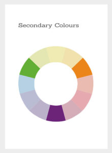
Secondary Colours
Secondary colours are made by mixing equal portions of the primary colours which create green, orange and purple.
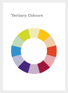
Tertiary Colours
Tertiary colours are made by mixing a primary colour with a neighboring secondary colour, for example if we mix the yellow with orange we'll get a yellowy-orange colour in between. If we continue to mix the primary and neighboring colours, we'll fill the gaps and get the remaining tertiary colours.
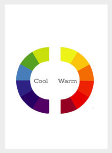
If we separate the colour wheel, we get two categories i.e. warm and cool colours. On the right we have the warm colours, which incorporate the red violet through to yellow.
This is a really useful tool designed to help us choose colour schemes. To help us choose interesting colour combinations that have harmony together or create contrast, there are some colour rules we can explore. These colour rules are referred to as: monochromatic colours, analogous colours, complimentary colours and triadic colours.
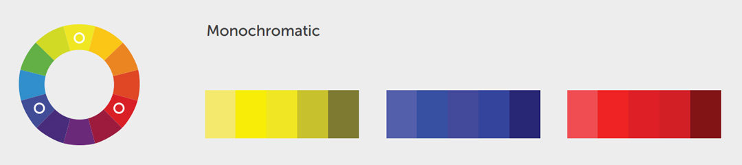
Monochromatic Colours
Monochromatic colours are shades and tints of the same colour. The monochromatic colour scheme is typically balanced and easy on the eye.
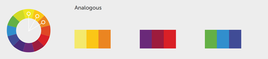
Analogous Colours
Analogous colours are those found close to each other on the colour wheel. Analogous colours typically work well together since they have similar origins. Like the monochromatic colours, they are also balanced but typically more interesting as these colours have more contrast.
Complimentary Colours
Complimentary colours are those found on opposite ends of the colour wheel. Complimentary colours have high contrast which produce vibrant exciting colour schemes. As implied, complimentary colours enhance each other and typically always work well together.

Triadic Colours
Triadic colours are those spaced equally on the colour wheel and they typically produce vibrant effects.
