Texture As A Visual Element In Graphic Design

The graphic part of graphic design, is made up of visual elements, the building blocks of design. Through the harness of artistic expression we choose these visual elements and arrange them on a surface in a layout to convey an idea.
The basic visual elements that combine to create graphic design include the following: line, colour, shape, texture, space, form and typography.
Whatever work you produce be it for a magazine, a poster, a website or advertisement, these visual elements will play a part in your design.
Texture
Texture is the way a surface feels or is perceived to feel.
Texture is used to create a visual tone and can influence the look and feel of a piece of graphic design work. It is also used to attract or repel interest to an element depending on the pleasantness of the texture.
In design, there are two types of texture: image texture and pattern texture.
Image Texture
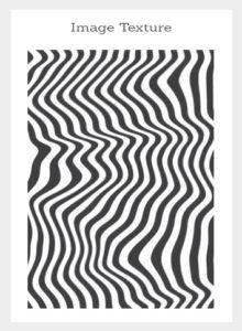
Image texture is generated from a combination of organic or geometric shapes and colour. It can be simple or complex and generally appears random to create a particular look and feel. Image textures tend to tantalise the senses and therefore, the eye is naturally drawn to image textures. They can be likened to the sense of smell and touch, you can't see anything in particular in it but overall it triggers emotions and sensations of touch.
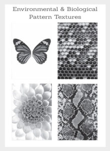
Image textures can be environmental, biological or man-made.
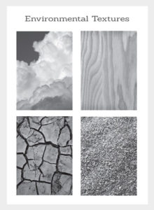
Environmental textures can be wood, grain, sand, water to the stars in the sky.
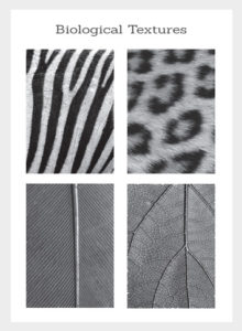
Biological textures can be skin, fur, feathers, and animal prints.
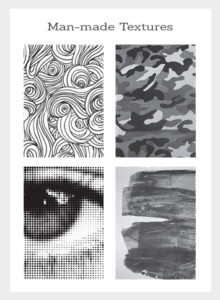
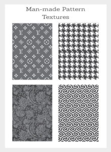
Man-made textures can be paintings, illustrations, dies, cloths, papers, typography, photographic effects, etc.
Because of image texture's abstract nature with the ability to trigger feelings, emotions and excite the senses, image textures can be used to engage and add distinct visual tone to a piece of graphic design work.
Pattern Texture
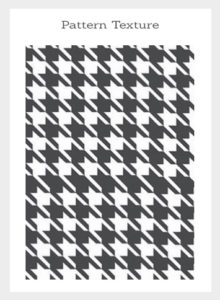
Pattern texture is also generated from organic or geometric shapes and colour though pattern texture is mostly manufactured. Patterns can be simple or complex but unlike image texture that generally appears random, patterns appear more structured.
Repeating a formation of shape and colour will result in a pattern texture and repeating a logo in a formation will also result in a pattern texture.
Like image texture, pattern texture also tantalises the senses but in a different way. Patterns triger our visual senses rather than emotional senses perhaps because pattern is more structured and less abstract.
Pattern is more about visual recognition due to the shapes that repeat themselves, because of this in design pattern texture is used and works well as decoration.
A good example of this is in branding. Pattern creates a very distinct look and feel and because of it's repetitive nature, a brand can use this visual design element as a way to decorate and make you remember their brand.
Another example is gift wrapping paper. Have you ever asked yourself why is gift wrapping paper mostly patterns rather than just a single image? And why do people spend so much money on it? One could conclude that the repetition of bright colours and images excite the visual senses. Often a gift may lay in an environment for a while awaiting to be opened such as under a Christmas tree. The decorative nature of gift-wrap serves as a prelude to the excitement of opening a gift therefore the gift wrap could be considered as important as the gift itself.
Source: Gareth David