Line As A Visual Element In Graphic Design

The graphic part of graphic design is made up of visual elements, the building blocks of design. Through the harness of artistic expression we choose these visual elements and arrange them on a surface in a layout to convey an idea.
The basic visual elements that combine to create graphic design include the following: line, colour, shape, texture, space, form and typography.
Whatever work you produce be it for a magazine, a poster, a website or advertisement, these visual elements will play a part in your design.
Line
One of the most basic visual elements of design is the line and it should not be underestimated. As simple as lines are they can be quite versatile and can be used as crucial elements of design. Lines can be straight, curved, thick, solid or dashed.
Lines can be used to add structure to a composition, to frame information and to divide information.
Used considerately, lines can add elegance to a composition, add hierarchy and to draw the eye to a specific point.
With type, lines can be used to emphasize and put stress on a word, a phrase or paragraph. Lines can be used to decorate, illustrate and represent information in infographics.
If we think about magazines, newspapers and maps, one of the most common visual elements is the line as it works very well to structure information.
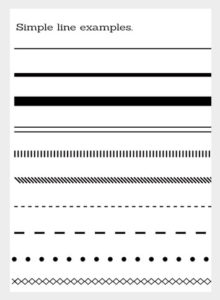
Here are some simple horizontal lines. We have some strokes in various sizes and below some alternatives. A line can be made of more than a single stroke, it can be made with many individual strokes and even dots.
Below are simple examples of how lines may be used in design.
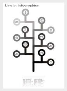
In this first example line plays a role of building infographics made of lines in different shades. Overall, a simple visual with another line below as an anchor point for the associated information.
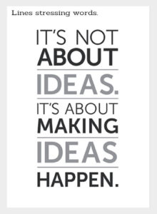
Next is an example in typography. Here lines are used to divide and draw emphasis to a particular word.
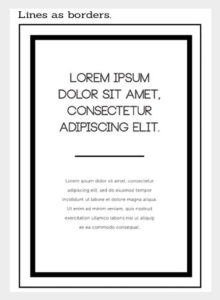
Next is an example where lines are used to create a border. In this example there are two stroke lines that create this thick and thin border. The type of stroke lines you use in a relationship to other elements can define the look and feel of your composition. In this case we have a boutique feel. Notice we also have a line that elegantly divides the type.
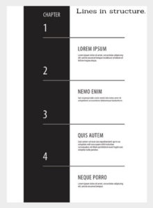
In this example lines are used to predominantly structure a composition but at the same time decorate. This is a simple chapter index page where we have a large dark line running vertically down the page and smaller lines running horizontally across the page. The horizontal lines are passing through the vertical and inverting in colour as they do so creating a loose grid for the type element to exist. You can see where the lines are defining and positioning the type elements.
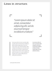
Next is an example where lines can be used for structure and decoration in a minimal elegant way. Here lines make up the board elements that frame a quote and a line is drawn vertically aligned left creating a base to carry the paragraph next to it. The lines in black and white could also be used to add a bit of colour onto the page as well as structure.
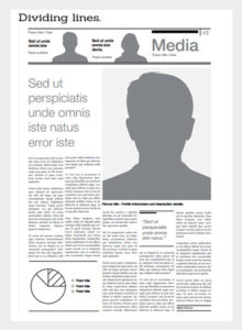
Next is a general example of how lines can divide information. Newspapers can be very complex and busy media platforms with a lot of information being presented at any time. Here we see how lines play a role to divide and decorate information. In this section we also have small lines, details used to decorate. A line does not necessarily have to be a solid stroke but can also be created by contrast of colour or shape on a page. In the article we have a big picture which even though there isn't any stroke applied to it, the solid colour fill of the image creates a line around it. Below this we have the main body of text in which we have an infographic made with lines and other lines that break information out such as diagrams, quotes and footers.
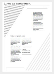
The last example shows lines creating decoration, texture and structure on a page. In this example, there are various types of lines being used. First we can see the physical line used to create decoration with various stroke effects applied. In this instance the lines also create another white line through the middle of the page as negative space. Here we have three columns of type where the third column is breaking alignment to fit in the space creating an interesting and dynamic layout.
There are lots of ways line can be used in design and the above are just a few examples. When looking at graphic designs be sure to observe how line has been considered and used as a design element.
Source: Gareth David