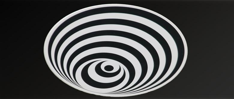
The Design Funnel doesn’t introduce any new tools. It’s simply a road map of when a designer can use which tools to stimulate better work. As a matter of fact, many successful creatives use similar processes on a daily basis.
Here are the steps:
- Define values and goals
- Discover moods and metaphors through association
- Generate ideas and define a concept
- Create a visual language
- “Design” it
Between each step comes the same sub-step: Verify that you’re on the right track.
Why is most design bad design? Because most designers “jump into the funnel” at step 4 or 5. These are the steps involving “using Photoshop” and other fun, tool-based stuff. The funnel, on the other hand, focuses on the hard mental work involved in designing. Let’s walk through these steps in more detail.
1. DEFINE VALUES AND GOALS
Notice that the Design Funnel is slightly different than the design process most of us have seen before:
- Define the problem
- Generate ideas
- Design stuff
- Pick the best design
- Produce it
These steps are implied in the Design Funnel, but the problem is defining the problem.
Ever heard a client say they’d like a “modern” design? how about something “dynamic”? Or “professional”? Well, what are these people talking about? Don’t worry about it. We’re at step 1. Our job is to aggregate everything the client (or you, if you’re designing for yourself) can give you, no matter how vague.
Ask the client what they want to accomplish, communicate, sell, or tell. Ask them for keywords describing their company, product, services, values, and most importantly, ask them for keywords describing how they would describe the ideal design for this project.
Remember that clients often offer solutions to problems instead of simply stating their problems. They’ll say, ”We want the focus to be on the brand, so the logo should be pretty big.” Don’t fire your client just yet. Just get this stuff down.
Ask lots of questions.
To whom are we communicating? Are there any branding guidelines? Who will be making decisions regarding the design?
Are there any restrictions whatsoever? Technical? Creative? What are they?
How will success be judged? What’s the budget?
What design work do you like? What don’t you like? Why?
Once you get the answers to these questions, go home. Review your notes, and then do nothing for a day or two. Let these things incubate. You’ll start to form ideas about what the client is looking for. Often, it’s not necessarily what the client says it is.
Do look at what the competition is doing design-wise, but see this simply as an orientation exercise. Note the things that work and the things that don’t. You will not be copying what the competition does. That would be design sameness. Read that sentence about five million times.
VERIFY: Reformulate the client goals in your own words, as YOU think they should be, based on your findings. Just goals, no solutions yet. Make the goals measurable, and give them a deadline. Present this to the client and ask if you understood them correctly. If the client agrees with you, go on to step 2. If not, review your notes again, think again, ask more questions, reformulate.
2. DISCOVER MOODS AND METAPHORS THROUGH ASSOCIATION
Now it’s time to start using the useless and vague keywords from step 1 and turn them into the basis for a successful design. Get all these keywords into one list and start brainstorming. Remember, in brainstorming, there is no judgment of ideas. You’ll do that later. You’ll want to brainstorm two things:
1. Metaphors.
“Strong” = Pirates? Body Odor? Superheroes? “Friendly” = Flirtatious? Family? Bartender? Smile? unusual associations are okay. Just record these.
2. Visual elements.
“Strong” = black, navy blue, pinstriped, jagged. “Friendly” = round edges, circular, orange.
Now you’ve turned words like “professional” into things you can actually picture. You should get as many associations down as you can.
VERIFY: Once you’ve generated as many associations as possible, start filtering your list by considering the end result for step 1. When put up to the light of the client goals and values, which associations hold up and which don’t? Discard the ones that don’t.
3. GENERATE IDEAS AND DEFINE A CONCEPT
You’ve got some useful associations; you can now begin brainstorming ideas for an overall visual concept based on these associations. Your concept may turn out to be to design a website which presents itself as a digital assistant “at your service,” or an office supply brochure presented as a fashion catalog. It could simply mean that your “friendly” design is based on editorial-style photo shoots of satisfied customers in their home environment.
Idea generation deserves its own manifesto. There are many, many techniques available. It can help to consider the opposite of every idea you get, or to place fake limits upon yourself: what if it had to be completed in one day? What if it had to be black-and-white?
Just looking at old books, architecture, and work from realms of design other than your own can give you an endless supply of surprising ideas.
Again, generate as many ideas as you can. Choose the one or two which arouse the associations you defined in step 2, and which still hold true to the client goals and values. Note that you are still not designing visually. You could, however, work out some conceptual sketches or “mood boards” along with a written (it helps) description of your concept(s).
The more ideas you generate, the higher the chance a winner is in there somewhere.
VERIFY: Present your ideas to your client. If the client accepts, go on to step 4. If not, congratulations! You’ve proven that design is not easy, and that more than Photoshop and some cool freeware fonts are required. You’ve already done a lot of the hard work. Revisit some of your discarded ideas or try some other techniques to come up with a few new ones. Sometimes it’s a numbers game. The more ideas you generate, the higher the chance a winner is in there somewhere. And if you really keep the original goals and values in mind, you won’t be far from home.
4. CREATE A VISUAL LANGUAGE
This is where a lot of designers jump into the design process. They note the client goals passively, and proceed to start making stuff. You now have more going for you than these designers. You have a concept. now you’ll start creating a “design language” for this concept. This “language” will allow you to “speak”, to tell your story in form.
The visual language will consist of the following elements (in arbitrary order):
Imagery: What types of images fit with your concept? Artful? Grainy? Aerial? Perhaps not even photography, but illustration? Which style? Perhaps no imagery at all?
Color: Which colors fit your concept? Which colors are naughty and don’t? Could you perhaps use those?
Typography: Think out of the box here. Don’t blindly use a “handwritten” typeface just because your concept has a “personal feel” to it. Surprise yourself, and you’ll surprise others.
Form: Again, think outside of the box. Wait—does it have to be a box?
Composition/Layout: Start considering where and how you’ll lay things out on a page.
If you are in a different field of design, you could choose texture, space, sound, materials, etc.
Don’t “design” just yet. You can brainstorm each element separately and see how they play together, or you can develop different elements at the same time. You’re finished when you feel the all elements work well together in different combinations. Your design language should be flexible.
VERIFY: Do your chosen elements play well together? Do some mockups and see. When you’re happy with what you’ve done, show the client. If they accept, go to step 5. If they don’t… boy, clients are a pain, aren’t they? hear them out, go back and come up with a solution which makes you both happy.
5. “DESIGN” IT
Ah, the fun part. Use your visual language and speak. Tell your story. now that you have approved mockups, it shouldn’t be hard to do.
During this phase you will often be required to design things you haven’t really considered thoroughly. How errors are presented on an incompletely filled contact form on a website, for example. Now that you have a visual language in place, it’s simply a matter of finding the right “words” to use.
Because of all the homework you’ve done, you’ll find this step quite fun and a lot easier to do than if you had just “started designing”.
This process is about design that communicates. Design that stands out. Design that will be considered more creative than most because it is based on ideas rather than design trends and cool techniques. This process starts at zero for every project. Nothing is determined beforehand, and you’re free to create something unique to fit each specific project. Don’t be afraid of the thinking, the brain work. As with anything, the more you do it, the better you’ll become.
Designers have their own bags-of-tricks which they could pull out at any time because they know exactly what response they’ll get. Good designers leave their bags unattended, or dispose of them altogether. You should do the same.
And when people ask you how you get all these creative ideas, you can say that they usually just come to you during your morning shower.
Source: Stephen Hay

