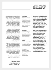
Alignment Principle Of Design

In graphic design, there are principles of design that should be considered. These principles are what typically separate good design from bad design. All these principles have a relationship between each other and appear in every well designed piece of work you see.
A good grasp of design theory will mean there is always substance behind your work.
The key principles of design are: contrast, hierarchy, alignment, balance, proximity, repetition, simplicity and function.
Whatever work you produce be it for a magazine, poster, website or advertisement, the principles of design should be considered.
A good designer will keep these principles and guidelines in their toolkit and will consciously use them to develop their ideas.
Lets have a closer look at the alignment principle:
Alignment Principle
Alignment is the placement of visual elements so they line up in a composition. In design, we use alignment to organize elements, to group elements, to create balance, to create structure, to create connections between elements, to create a sharp and clear outcome.
In design there are two alignment principles: Edge alignment and Center alignment.
Edge Alignment
Edge alignment is either to the left, right, top or bottom.
Center Alignment
Center alignment as it states is aligned to a center line down the middle or across the horizontal.
Alignment is often an invisible line visual elements are aligned to but can also be hinted at physically. Alignment can be used to achieve a particular look and feel. One should always be conscious when working with alignment to achieve the intended result.
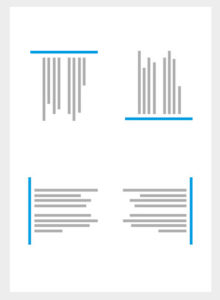
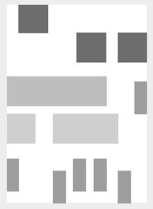
Good Alignment
Bad Alignment
Where visual elements are aligned, a composition can appear clear, confident, elegant, formal and trustworthy. Good alignment is invisible i.e. this doesn't have to be a literal line in your design.
In design, one should try and avoid the appearance of having made arbitrary decisions. When visual elements are out of alignment, it is noticeable, and can devalue a piece of work if done unintentionally.
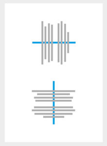
Mixed Alignment
If mixed alignment is intended as part of a design, it can appear more radical, dynamic, free and playful.
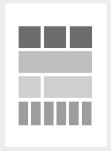
Grid Examples
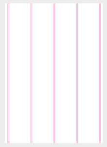
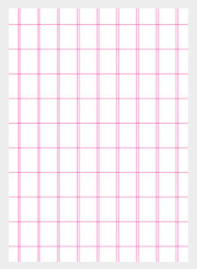
Alignment can be simple or complex and is commonly achieved with the use of a grid. A grid can create an invisible structure on which visual elements can be placed on. These grids can ensure accurate alignment and consistency in a large piece of design work. Nowadays, grids are typically constructed in design software as a guide when layout is created on a computer.
The following examples demonstrate various approaches of alignment in design.
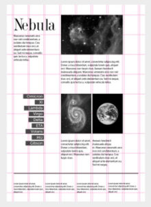
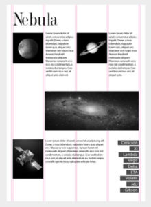
First we have a typical layout based on a grid of three columns. We can see how the line elements hint at the grid structure while the main title and image fits nicely into the two far right columns aligned with the article copy below. Everything in this composition appears well aligned, neat and organized. Alignment is typically used to organize and create a degree of structure as seen in the previous examples. However, alignment can also be used in more abstract ways as part of a visual message or to add dynamics to a layout.
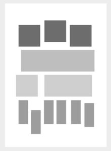
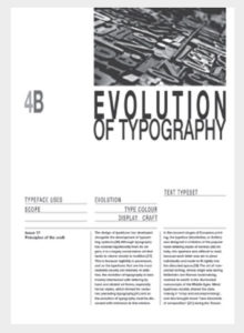
The next example explores alignment both vertically and horizontally which creates a nice dynamic on the page. The main title is aligned to the top of the page and the cap height of the header type is defining the column widths below. The lists below then follow down the page aligned to the left of the columns defined by the header type above.
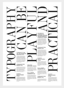
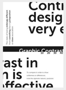
Next is a type composition exploring both left and right alignment of type. The contrast between alignment in each column creates an interesting dynamic on the page.
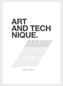
Here's another simple layout. On top we have a bold header and beneath this we have a column of type. The justified type itself is aligned to the left but the column flows down aligned along a diagonal spine. This adds an interesting dynamic to the composition suggesting movement and direction on the page.
This layout is a lot more abstract and attempts to challenge the limits of alignment. Through the implementation of contrast in type size, weight and alignment, a more radical and freestyle composition is achieved here.
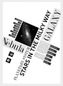
This last example is another abstract composition. The elements here seem to suggest no hierarchy, no formal order. The contrast between the contradictory alignments creates an interesting visually stimulating composition.
The above are just a few examples showing the variety in which alignment can be utilized in both practical and more abstract design.
When you look at a design, ask yourself how has alignment been considered, is there a clear structure that has been used? What grid structure might have been used to create it? And how well does it work as part of the design?
Source: Gareth David