Balance Principle Of Design

In graphic design, there are principles of design that should be considered. These principles are what typically separate good design from bad design. All these principles have a relationship between each other and appear in every well designed piece of work you see.
A good grasp of design theory will mean there is always substance behind your work.
The key principles of design are: contrast, hierarchy, alignment, balance, proximity, repetition, simplicity and function.
Whatever work you produce be it for a magazine, poster, website or advertisement, the principles of design should be considered.
A good designer will keep these principles and guidelines in their toolkit and will consciously use them to develop their ideas.
Lets have a closer look at the balance design principle:
Balance
Balance is the visual weight of elements in a composition. Balance is used to add stability, add structure, create emphasis and to create dynamics. In design, one should attempt to place visual elements in an aesthetically pleasing arrangement, or particular arrangement to fulfill a purpose or achieve a particular look and feel.
There are three main types of balance:
Symmetrical Balance (formal)
Asymmetrical Balance (Informal)
Radial Balance
Understanding these three types of balance will help achieve the right type of visual effect in your design.
The following are some examples of balance:
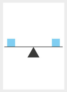
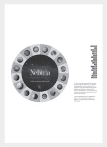
Symmetrical Balance
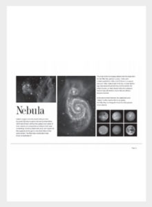

Symmetrical balance is mirror image balance. If you drew a line down the center of the page, all the visual elements on one side of the screen are mirrored on the other side. They don't have to be identical visual elements but can be similar in number, colour, shape and scale. When visual elements are equal in weight, they are said to be in balance.
Symmetrical balance can be used when one wishes to achieve a formal design, a sense of structure, a sense of organisation and stability.
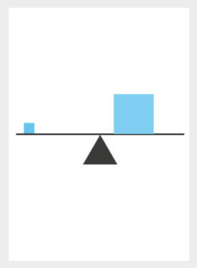
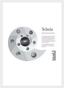
Asymmetrical Balance
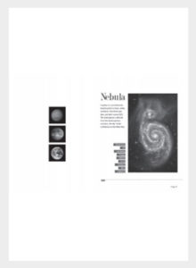
Asymmetrical balance is used to describe a kind of balance that is not identical on both sides of a central line i.e. not relying on symmetry, opposite of symmetrical balance.
Asymmetrical balance occurs when several smaller visual elements on one side are balanced by a large visual element on the other side or smaller visual elements are placed further away from the center of the screen than larger visual elements.
Asymmetrical balance can be used when one wishes to achieve a more casual or less planned look and feel. An asymmetrical composition can create a sense of tension as if the page or screen may tip or things might slide off the side. Asymmetrical balance is more dynamic than symmetrical balance and normally keeps the audience's attention focused on the visual message.
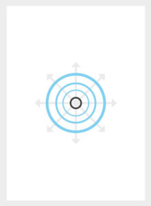
Radial Balance
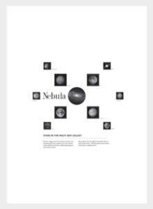
The third type of balance is radial balance where all elements radiate out from a center point in a circular fashion. It is very easy to maintain a focal point in radial balance since all the elements lead your eye towards the center.
Depending on the intended purpose or look and feel, a designer must sense which type of balance to execute. A designer must sense whether or not a composition is balanced or not. Success in using good balance can help achieve a strong visual effect and good quality designs.
When you look at a design, ask yourself how has balance been considered? What part does balance play to create the overall design? Is there a good or bad sense of balance? And how well does it work as part of the design?
Source: Gareth David