Hierarchy Principle Of Design

A good grasp of design theory will mean there is always substance behind your work.
The key principles of design are: contrast, hierarchy, alignment, balance, proximity, repetition, simplicity and function.
Whatever work you produce be it for a magazine, poster, website or advertisement, the principles of design should be considered.
A good designer will keep these principles and guidelines in their toolkit and will consciously use them to develop their ideas.
Lets have a closer look at the hierarchy design principle:
Hierarchy
Hierarchy is the control of visual information in an arrangement or presentation to imply importance. Hierarchy influences the order in which the human eye perceives what it sees.
In design, hierarchy is used to:
- Add structure
- Create visual organisation
- Create direction
- Add emphasis
- Help a viewer navigate and digest information easily
Hierarchy is typically created by contrast between visual elements in a composition. Typically visual elements with highest contrast are noticed first. Using hierarchy we can control how a viewer engages with information to ensure that information is navigated and digested in the way it is intended. For example: Where do we want the eye to look first, second, third and so on.
Establishing clear visual hierarchy is important because it holds a design together. Used effectively, hierarchy can make a complex message simple.
In design, hierarchy can manifest itself in many visual ways. It’s through the careful arrangement of visual elements that creates a clear hierarchy. Hierarchy can manifest itself in many visual ways such as in scale, colour, contrast, space, alignment, shape and form.
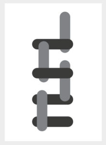
Hierarchy in scale
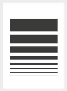
Here we have some stroke lines going from thick to thin, from top to bottom in eight steps. The hierarchy of scale in these eight steps also suggests direction of hierarchy. The flow of importance here starts from the top and travels down from thick to thin. The next example challenges this perception.
Hierarchy in colour
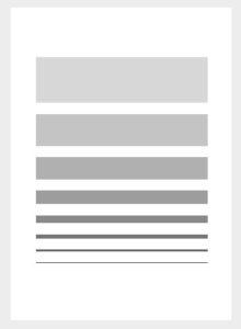
Here we have the exact same composition but this time, the colour has been changed. In this example, the thinnest stroke is the darkest colour and the thickest stroke is the lightest colour. Even though the strokes are larger above, the thin stroke is perceived as bolder and stronger because it’s more apparent and appears closer, more in focus. By changing the colours we have changed the hierarchy structure.
Hierarchy in scale
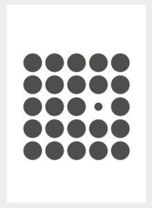
This example demonstrates hierarchy in scale again but also contrast. By contrast in scale and number this suggests that the larger circles carry more importance than the smaller one.
Hierarchy in colour
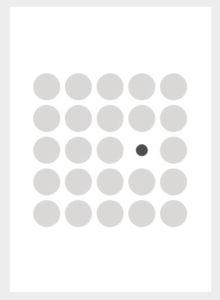
If we modify the colour, this creates a new dynamic and shifts the hierarchy. By contrast the smaller circle is now more prominent.
Hierarchy in colour

The inside shapes are more darker than those on the outside therefore we perceive them as more prominent.
Hierarchy in space
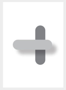
If we change the space of these shapes through overlapping, we now create a new hierarchy. The shapes that are on top appear closer to us and they are the ones we see more clearly. Hierarchy here is now defined by space.
Hierarchy in Depth
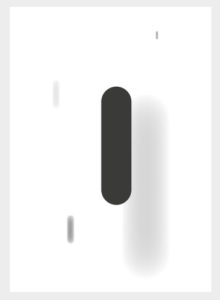
In this example we have the same shapes in various colours but this time the shapes are in various sizes with various blur effects applied. This creates an illustration of depth unlike with space in the previous example. It’s not necessarily about the shapes that appear closer to us here but the shapes that appear the most clear to us. Shapes that are most in focus do a better job of attracting the eye.
Hierarchy in Perspective

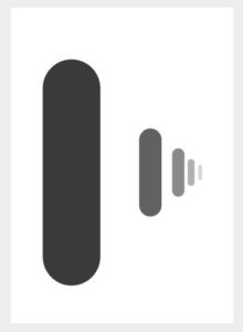
Here we perceive the shapes coming closer to us. The flow of hierarchy here starts from the perceived front and moves towards the back into the distance.
In design, depending on the simplicity or complexity of the intended message, hierarchy in design can exist in multiple forms and compete against each other at the same time.
The following are some practical design instances where hierarchy plays a role.
This is a simple index page which has a lot of information but through the consideration of alignment and space, each subsection from the top down takes a step to the right and there is adequate space separating the individual parts. The header and sub-header are a different and bolder typeface to the body copy highlighting important breakpoints. All this works together to create a clear and comprehensive list easy to navigate. Hierarchy here exists through contrast in alignment, space, colour and typeface.
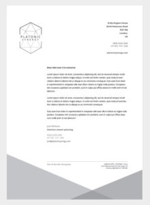
In this next example we have a letterhead which come in various designs but they typically follow the same pattern. Hierarchy here is working in composition as well as typesetting. Letterheads will almost always lead with a brand. In this example the logo in the top left is looking pretty prominent. To the right of this is the address details of the company which contrasts nicely with the main message. So the top of the letterhead is pretty prominent here and communicates the important information about the company. Below is where the main message is placed. The margin here is quite large which leaves for some nice negative space down the left side which creates a nice clean design which also gives prominence to the logo. Below this we have a footer with some required details. There’s a small horizontal stroke to partition this away from the message and the type size is smaller so as not to clash with the main message. And finally, below this we have simple blocks of colour which are part of the brand motif. For a simple letterhead, there is quite a lot going on here but through careful consideration of the visual elements, the order of importance is nice and clear.
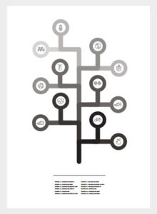
Next is an example of a simple infographic. Hierarchy here is working in the illustration and in the overall composition. The graphic above clearly illustrates a timeline or tree diagram. The diagram starts from the base and in this instance the flow of information starts from the bottom to the top, from dark to light distinguishing the various branches. Placed below this is a simple list which is a reference to the visual above. Overall, the illustration is the most dominant visual element here supported by the reference below.
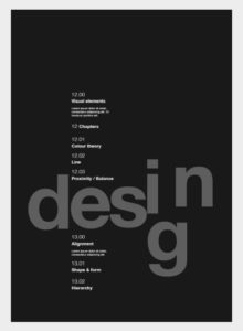
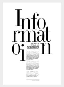
This is an example of where hierarchy starts to push the boundaries in more creative layouts. First we have an index page where hierarchy exists in many forms. Overall as small as the white type is, compared to the title it still exerts more prominence due to the contrast in colour. The type here is not treated as individual elements but as one rigid column cutting through the loosely scattered title below. Within the column we have a number or type sizes and weights which creates contrast to distinguish order. The title is left as a playful decorative piece in a darker tone allowing the column type to come to the front.
Next we have a simple layout that could easily be a magazine article. The composition immediately draws your attention to the large playful type layout. Then we have a sub-header and the body copy below. Contrast is created between the sub-header and body copy by two different typefaces, sizes and also by the right alignment of the sub-header and the left alignment of the body copy. Below this we have a small horizontal stroke signifying the end of the article.
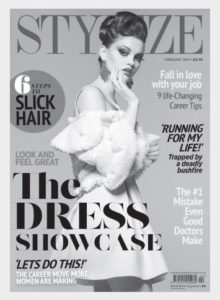
In this magazine cover, hierarchy starts to get really complex. This media is common for communicating a lot of information in one instance. Hierarchy typically establishes itself through overlapping space and size. Generally a magazine cover will revolve around one main point of focus. In this example we can see the image of the woman is on top of the magazine title. Then the header of the article which the photograph supports is on top of the photo. So the three important parts of this composition are: big title, person’s photo and the magazine title. After that we have some hints of what else is in the magazine via sub-headers around the figure in the picture. There’s also a call out in a circle which compared to the other sub-headers, does draw our attention more. This suggests the magazine sees this article as something people want to read perhaps to draw attention to buy the magazine. For decoration and dynamics, the other titles have been applied in various typefaces but don’t typically compete too much with each other.
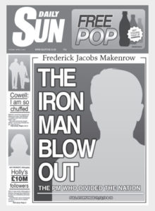
Next is the newspaper example. Unlike the magazine cover which revolves around a single main point of focus, the newspaper will want to shout about multiple headlines at once. Hierarchy typically establishes itself on newspaper covers through contrast in scale. On newspaper covers, the most prominent article will exert the most space on the page and less prominent articles will sit next to or around it. In this example we see the main prominent article taking up most of the space and the smaller articles are positioned to one side.
When you look at a design, ask yourself how has hierarchy been considered? Is there a sense of hierarchy? What visual mechanisms have been used to create it? And how well does it work as part of the design?
Source: Gareth David