Proximity Principle Of Design

In graphic design, there are principles of design that should be considered. These principles are what typically separate good design from bad design. All these principles have a relationship between each other and appear in every well designed piece of work you see.
A good grasp of design theory will mean there is always substance behind your work.
The key principles of design are: contrast, hierarchy, alignment, balance, proximity, repetition, simplicity and function.
Whatever work you produce be it for a magazine, poster, website or advertisement, the principles of design should be considered.
A good designer will keep these principles and guidelines in their toolkit and will consciously use them to develop their ideas.
Lets have a closer look at the proximity design principle:
Proximity
Proximity is the grouping and shaping of objects in a composition. In design we use proximity for two main reasons:
- To Create Connections
Proximity can create relationships between visual elements in a composition, create relevance, hierarchy, create organization and structure. - To Dispel Connections
Proximity can also be used to suggest no relationship between elements, to break organization and structure.
By moving visual elements closer together or further apart, we are applying the proximity design principle. In design these two forces can be applied in various degrees to help achieve a particular effect or outcome to communicate a message.
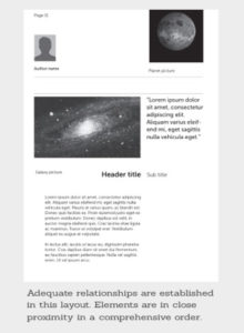
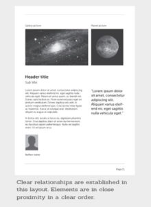
Typically in design, related elements should be grouped together so that they will be viewed as a group. Unrelated elements should have distance and should not be in close proximity to each other. Audiences will assume that elements that are not near each other in a design are not closely related.
A good sense of proximity in design can help differentiate visual elements to reduce visual clutter and make design more comprehensible. Proximity is influential to the balance and hierarchy design principles. Space between visual elements will communicate a particular dynamic on a page. Depending on the intended purpose or look and feel, a designer must sense which type of balance to execute to suggest hierarchy.
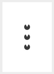
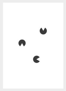
Here we can see the same message but laid out in various different ways. The most comprehensible layout can easily be picked out.
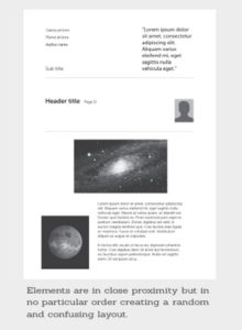
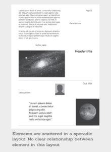
Audiences should never have to work at trying to figure out which caption goes with which graphic or whether or not a line of text is a subtitle or a line of text unrelated to the title. Viewers should never have to work trying to figure out the connection of information in a design. This makes for a poor user experience and an inability to digest information.
In design, one should avoid the appearance of having made arbitrary decisions.
When visual elements appear randomly or poorly positioned, it is noticeable, and can devalue a piece of work if done unintentionally. When we begin to place shapes together we create a particular relationship between them.
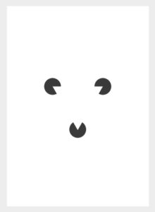
In the above examples we have three individual shapes. If placed together with just the right proximity, negative space is made to suggest a new visual shape entirely. This gives new meaning to the individual shapes that make this composition. If we move them even slightly this visual/message is lost.
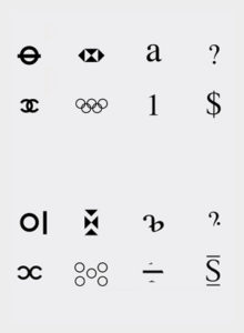
From a young age we learn shapes and symbols that are imprinted into our memory. The alphabet for example, these shapes and symbols are used to communicate visually as a visual language or represent meaning when we think of all the symbols and logos we know so well. It's through the combination of shapes and proximity that works to imprint images into our memory.
If we take the above most simplest and well known shapes and alter their proximity, they no longer have their meaning and become something entirely different.
However simple or complex, it's the relationship or lack of relationship between shapes that can trigger feelings, convey messages, engage an audience, add emphasis to a portion of the layout and create dynamics.
Proximity is a powerful principle to use in design. A good grasp and sense of proximity can be the difference between good and amazing design.
When you look at design, ask yourself how is proximity being considered? What relationships has the designer created or dispelled? How has proximity been used to create the overall composition? and how well does it work as part of the design?
Source: Gareth David