Repetition Principle of Design

In graphic design, there are principles of design that should be considered. These principles are what typically separate good design from bad design. All these principles have a relationship between each other and appear in every well designed piece of work you see.
A good grasp of design theory will mean there is always substance behind your work.
The key principles of design are: contrast, hierarchy, alignment, balance, proximity, repetition, simplicity and function.
Whatever work you produce be it for a magazine, poster, website or advertisement, the principles of design should be considered.
A good designer will keep these principles and guidelines in their toolkit and will consciously use them to develop their ideas.
Lets have a closer look at the repetition principle of design:
Repetition
Repetition is the reusing of the same or similar elements throughout the design. Now this is not to be mistaken for repetition of visual elements as a pattern. Visual elements as a pattern is more to do with visual style or visual artwork in an overall piece of design work.
Good design practice seeks to repeat some aspects of a design throughout a piece of simple or complex work. We use repetition to create a sense of unity and consistency throughout a design. Repetition creates a particular style, creates cohesiveness, creates emphasis, hierarchy structure and strengthens a design.
The ultimate goal of any piece of graphic design is to make an impression, hopefully a lasting impression.
If a design achieves this goal, it will be fulfilling it's purpose to communicate and insist upon a particular message which lingers and becomes familiar.
It could be said that repetition in design is a type of brainwashing. The more we see of something the more we familiarize with it, thus remember it. Whether we like it or not, repetition is impressionable. It's human nature to find comfort and attraction to familiarity.
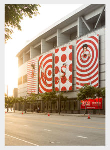
A good example of the use of repetition in design is in branding. In any good brand there will be a consistent use of a graphic style or language. This can manifest in many forms such as the use of a particular color or color scheme, a consistent use of a typeface or set of chosen typefaces, shapes and motifs, patterns, alignment, photography style, tone of voice and so on.
All this is not done as a coincidence. This is a carefully orchestrated design to create a noticeable and memorable look and feel. It is valuable to any business that their brand is impressionable and memorable. The same can be said for presentations, leaflets and brochures. It really pays to maintain focus and consistency which adds value.
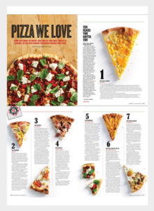
Another good example is in magazines. If you flick through any well designed magazine, you will notice a consistent style throughout. This is done to create a particular user experience which you will become fond of and want to experience again and again.
When you look at a design, ask yourself how is repetition been considered? What elements have been repeated and how? Is there clear consistency? And how well does it work as part of the design?
Source: Gareth David