
The graphic part of graphic design is made up of visual elements, the building blocks of design. Through the harness of artistic expression, we choose these visual elements and arrange them on a surface in a layout to convey an idea.
The basic visual elements that combine to create graphic design include the following: line, colour, shape, texture, space, form, and typography.
Whatever work you produce be it for a magazine, a poster, a website or advertisement, these visual elements will play a part in your design.
Space
Space creates the visual essence and dynamic of a composition. In design, there are two types of space: positive space and negative space. Positive space can be perceived as two dimensional or three dimensional.
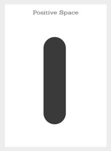
Positive space refers to the shapes of objects. It usually refers to anything that is considered the main focus of the page.

Negative space is the white space or empty space which is the part of the design that is not there, the space between the visual elements. This can also be the background colour of a design. Negative space can be just as integral to the design as the positive space. Negative space is important because it helps frame and contain a composition plus it also connects or disconnects shapes to suggest relationships between shapes. Negative space avoids visual clutter and looks clean which can help balance a composition and help focus the viewer on something specific.
In design what creates positive and negative space is the arrangement and visual appearance of shapes within a composition. In two dimensional design, proximity, overlap, opacity, light, shadow, and perspective can be applied to shapes to create visual dynamics.


Proximity is simply the distance shapes are from one another, far apart or close together. Proximity suggests relationships between shapes.

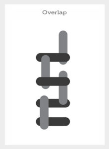
Overlap is the effect where shapes are arranged to appear to be on top of each other. This illusion makes the top element look closer to the observer.


Opacity is the effect where objects appear transparent. Degrees of opacity can make elements look heavy or light to suggest dominance and order of closeness in a space. Opacity blurs the barriers between positive and negative space. Overlapping transparent elements can create dynamics in a composition to create an illusion of 3D and perspective.


Light and shadow can give an object a three-dimensional look. Shadow can create the illusion that an object is on top of another and suggest how far apart they may be.


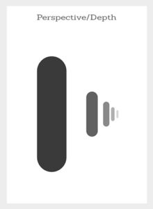
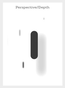
Perspective is created through the arrangement, creation, and manipulation of shapes to look like they appear in real life. This is the effect where shapes appear to get smaller the further away they get. Perspective can also be achieved through the use of relative sizes of objects, overlapping objects plus blurring and sharpening of objects.
In design, there is no way to determine the depth of the space, only the order of closeness. We can also use positive and negative space to create a focal point, create balance, set a visual tone and define a look and feel.
Source: Gareth David