To some, designing a logo may be simple. After all, it's just one small graphic, right? Because of this fact, it's actually a big challenge. With all the visual possibilities, how do you boil it down into one image, one icon, or one symbol to represent a product or business? That's a lot of pressure and it can be a big challenge getting this right. However, there are a few things we can keep in mind to help us. All the most successful logos share similar qualities that make them great. The following are key points to consider when coming up with a design for your logo.
So, what makes a good logo?
When designing an effective logo, there are a number of factors you will want to ensure: A good logo will be simple, memorable, distinctive, appropriate, versatile, and timeless.
Simplicity
One of the main principles you want to keep in mind when designing a logo is, to keep it simple. A logo should be simple so it can be easily recognized, instantly identifiable and have maximum impact. Simple logos tend to be more memorable and will also retain their clarity when used in different design contexts. Simple logos also work in large and small formats. If a logo is too complex or busy, then its detail may be lost when it is reduced in scale.

The above are simple logomark examples. If you're wondering why they're featured in black and white is because we're purely focusing on the shape and form of the logos and not the brand colours. These logos are immensely simple, using negative space beautifully.

The above are some simple examples of well-known lettermark-style logos. Again, we see how simple these are, with interesting use of negative space on CNN, and simplification treatment on V&A.

The above are simple examples of popular wordmark-style logos.
The above are some examples of simple script wordmark style logos.
The above are simple examples of some well-known and simple combination mark style logos.

The above are simple but well-known emblem-style logos. Even though they include logotype and shape elements, they are still extremely simple in their execution, using negative space nicely.
When designing your logo, try to keep it simple.
Memorability
Another important principle you want to keep in mind when designing a logo is memorability. This principle carries on from the simplicity principle.
If your logo is simple, chances are it will be easily recognised and instantly identifiable. A logo should convey an immediate and memorable identity and must connect with its target audience in a positive manner. A logo can be clever, bold, elegant, or simply have character which are characteristics that will make an impression.
The above are good examples of memorable logos.
Make it Distinct
Another important principle you want to keep in mind when designing a logo is, to make it distinctive. A logo should strive to be unique, attract attention, stand out from the competition, and leave a lasting impression. The more distinct a logo is the more likely it will be remembered.
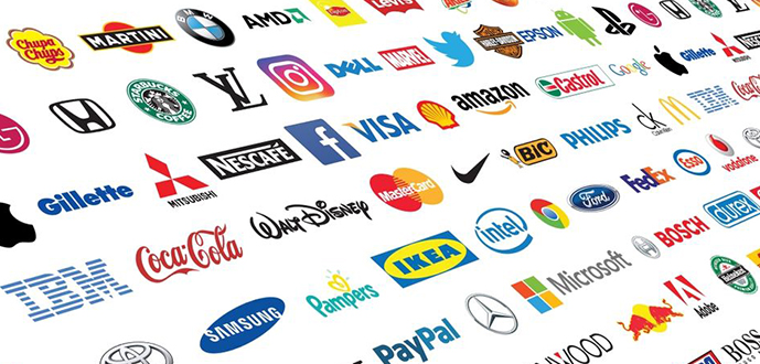
The above are examples of well known distinctive corporate logos. When we look at all these together, they do share some common similarities. For example, almost all of these logos are lockup combination marks but they all do a good job of distinguishing themselves from each other.
Technology company logos.

TV and broadcasting logos.

Fashion and boutique logos.
High street retail logos.
If you take a little more time to look at the above logos, you'll find that they're all doing a good job at being distinctive.
Make It Appropriate
It's important to keep in mind the context of the company, institution, or product you are designing for. A logo will want to communicate the correct values and connect with its target audience in a positive manner. Be it trustworthy, formal, creative, fun, traditional, contemporary, youthful or mature, the right impression will have to be captured.
A logo should ultimately derive its meaning and quality from the company, institution, or product it symbolizes. A logo does not sell directly, it only identifies.
The above are good examples of appropriate logos where we can see a clear distinction between them all, most notably because each logo is from a different industry with different values and target audiences. None of these logos depict what they represent in a literal sense. All of them have been designed to give off a certain character and vibe, reminiscent of the context of their industry and product.
Versatile
A logo should be simple enough and legible enough to work across a variety of media platforms. Ideally, a logo should be able to work in any size, small or large, vertically or horizontally.
As mentioned earlier, there is a range of various logo styles and it would be important to keep in mind that some of these styles are more versatile than others and work better in various media environments as shown below.

The benefit of the logomark is that it will work in most instances, large or small.

The logotype will typically work better in horizontal spaces, rather than vertical spaces. In very thin vertical spaces, the logotype will begin to struggle. This logotype is versatile but does have its limitations.
The lockup combination mark can respond to its environment and change its lockup. In larger spaces, the logo can remain, and in smaller, cramped instances, the logo can change its lockup. Notice the above example with a variety of lockup combinations to best fit the media environment but they are all the same logo. This is why the lockup combination mark is one of the most popular logos as it benefits from both the interesting logo mark element and the direct logotype element. These are often interchangeable, to fit into a variety of media environments.
Similar to logomarks, emblem logos are also one of the most versatile. The emblem is versatile because it's self-contained, works well when scaled up and down, and looks the same in every instance. These are important principles to consider when designing a logo. If your logo is to be designed for a specific media environment, this can influence its execution.
How will a logo look as a silhouette?
A logo should try not to rely too heavily on colour for its memorability and recognisability as this may be lost when used in black and white. An effective logo should avoid drop shadows and feathering if it is to work in black and white.
From the above examples, we can see that even without their well-known colour schemes, they are still distinct and recognizable.
Make it Timeless
A timeless logo is one that commands the greatest respect because it has stood the test of time, remained confident and resisted design trends and technological influence. The success and reputation a company, institution or product has or gains will ultimately add value to the logo. If a logo is so simple, distinctive, and works well across media environments, then there should be no need to change it in future.
The above are very good examples of timeless logos.
The original incarnation of the General Electric logo was made in the late 1800s, as a monogram. In the early 1900s, the monogram was incorporated into an emblem and has gone largely unchanged for over 100 years, only to lose its gradient and shadow effects to become flat in the early 2000s.
The Coca-Cola logo became a script-based logo back in the early 1900s and has gone largely unchanged for the past 100 years only to become more refined.
The Starbucks logo which was first introduced in the early 70s incorporated the two-tailed mermaid, Siren, from Greek mythology. Over the past 50 years, it has evolved from an emblem logo to the simple logomark we see today.
The Volkswagen logo in the mid-1940s became the simplified VW emblem we recognize today. Since then, it has undergone minor changes in colour and detail.
In 1912, Ford introduced the familiar script logotype and in 1917, it was placed inside the well-known oval shape and has undergone few changes since only becoming more refined.
In 1976, Apple introduced its first apple-shaped logo which featured six bars of colour. On the Apple II computer, it even included a logotype element. In 1998, they would simply remove the colours and move forward with the flat minimal logomark design that they use to this day.
The above examples may have started as obscure executions but they all established a particular identity and refined that over decades. Over decades, these brands and logo identities have become icons and it will be impossible to imagine them ever changing.
Therefore, when attempting to create a timeless logo, try not to be influenced by trends. Keep it simple, distinctive and versatile.
Source: Gareth David